
Wildfire Minigames Collection
Art Direction: Why We Chose a Stylized, Low-Poly Look for Our Wildfire Games
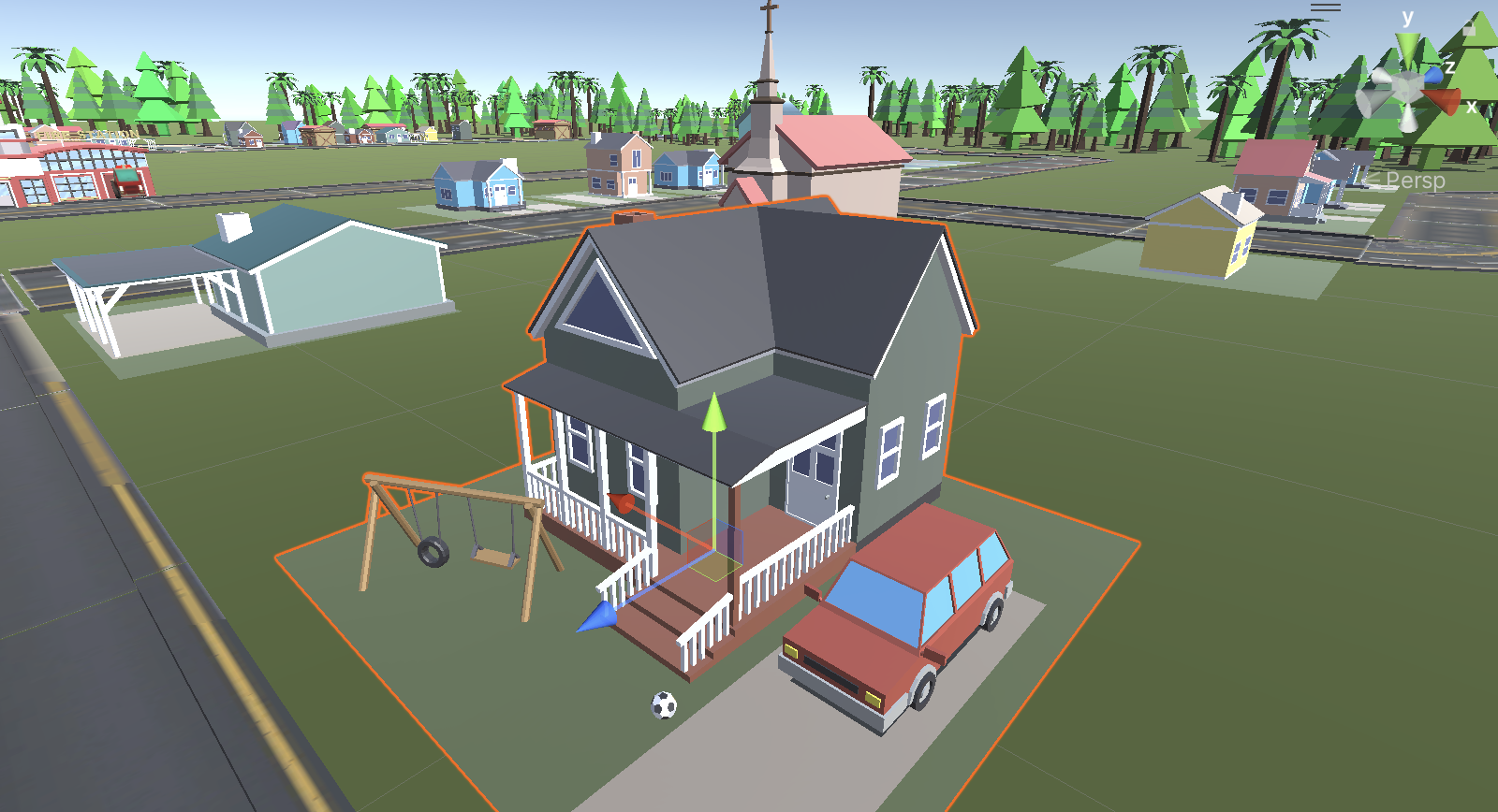
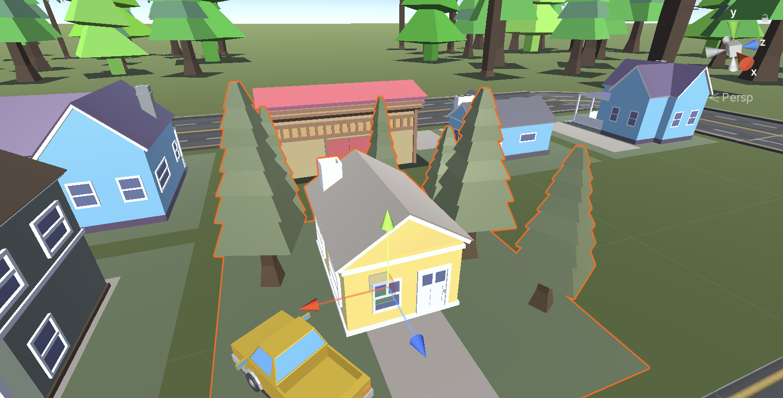


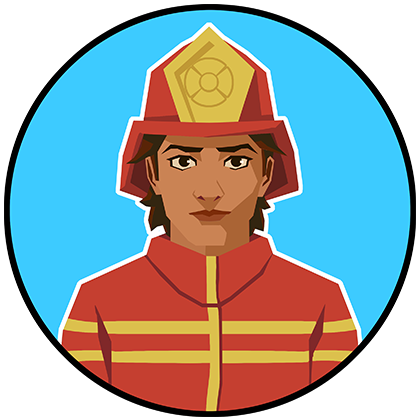
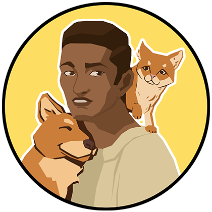
When people think of serious games, they often imagine something dry or overly realistic. But for our wildfire resilience games, we chose an art style that’s colorful, simple, and low-poly—and that decision was about more than just aesthetics.
Performance Comes First
Our games are designed to be widely accessible, which means they need to run smoothly on a wide range of devices—from school laptops and Chromebooks to mobile phones and web browsers. High-fidelity models or complex effects would slow things down and limit who could play.
By going with a low-poly, stylized look, we dramatically improved performance without sacrificing visual clarity. This lets us simulate entire communities, animate fire spread, or show dynamic evacuation scenes without overwhelming the system—or the player.
Designed for All Ages
Wildfire resilience is a topic that affects everyone. We want our games to be playable by middle schoolers, adults, and even older adults who might not play games regularly. The stylized visuals help with that. They’re friendly, non-threatening, and instantly readable. Instead of realistic flames and destruction, we use abstracted fire and softened visuals that encourage curiosity rather than fear.
This also helps us strike the right tone: serious, but not scary. Reflective, not traumatic.
Universality Through Simplicity
A stylized world also avoids specific geographic markers, allowing players from diverse communities to project their own experiences onto the characters and settings. A simple visual language supports empathy and immersion by leaving room for the imagination.
In short, our art direction is doing a lot of work behind the scenes: keeping the game fast, accessible, and emotionally approachable. It’s a reminder that sometimes, the simplest style choices are also the most strategic.
Wildfire Minigames Collection
A collection of minigames to help people develop preparedness and resilience to wildfire
| Status | Released |
| Authors | Wildfire UCSC, Yiyang Lu |
| Genre | Simulation |
| Tags | minigames, wildfire |
More posts
- Tech Discussion: Simulating Fire That Feels Real9 hours ago
- From Workshop to Production – Turning Community Stories into Playable Scenario...1 day ago
- Critical Interdisciplinarity2 days ago
- When Good Ideas Go—Iterating with Communities and Experts3 days ago
- Concept Chunking: a Minigames Approach to Tackle Complex Topics in Game Design3 days ago
- Building Empathy Through Storytelling and Role-Play4 days ago
- Multiplayer, Cooperation, and Discussion5 days ago
- Autonomy and Agency vs Gamification5 days ago
- The "Serious" Side of Serious Games: Staying True to Life6 days ago
Leave a comment
Log in with itch.io to leave a comment.